

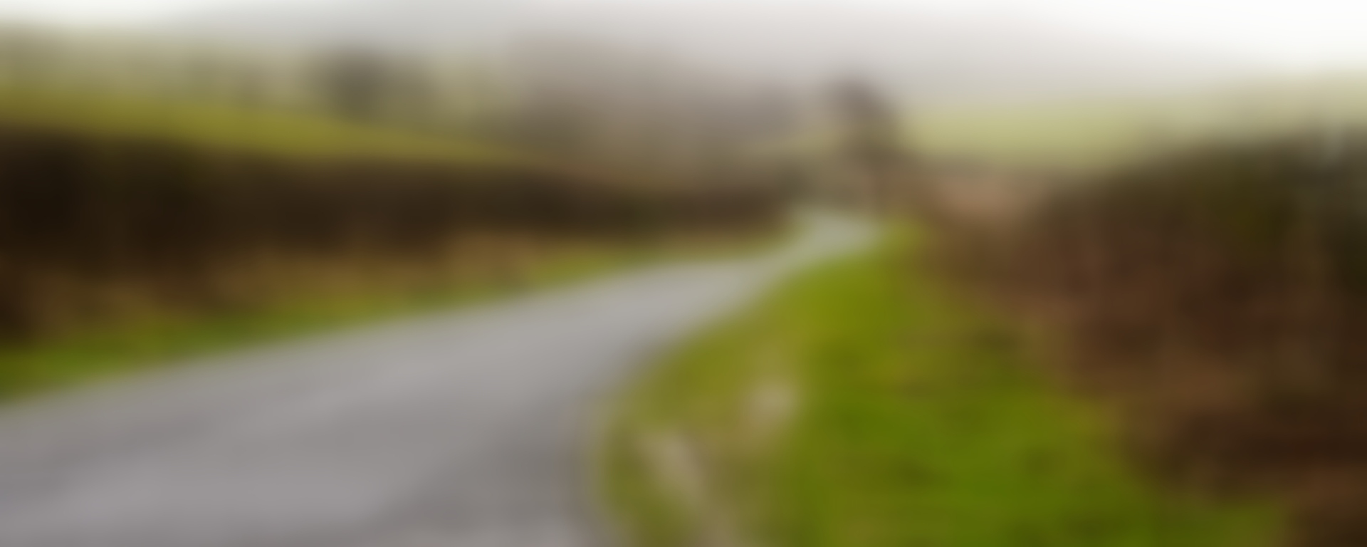
According to my Pinterest boards I’ve been aware of Gerhard Richter and his work for some years, but it was only seeing this picture

a few days ago that led me to see how important he/it is to me. It reminds me of the slightly grubby net curtained windows of my childhood. There’s a holiday cottage feel; is that a garden of salt wind battered shrubs veiled by the nylon? I can see a shingle beach, cut knees, a much worn hand-knitted sweater of dubious origin, a burger van run by a grumpy man too fat to stand on his feet all day. As you can imagine I was instantly smitten, and went straight to his website to find out as much as I could about Richter. I’ve barely stopped looking since. And I found this:
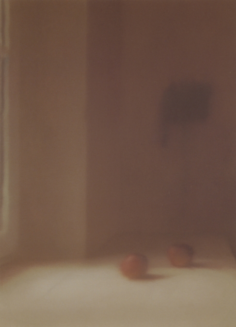
which I assumed was a photograph (until put right by the caption). It’s like the love child of an Antonio Lopez Garcia painting, and a Josef Sudek photograph, and I find myself quite hypnotised by it. Add

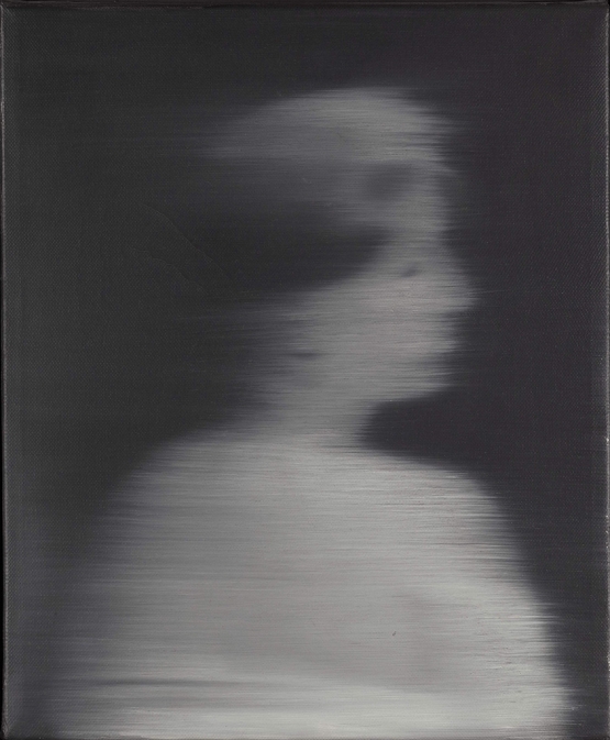
and you’ll begin to see a pattern, if not to Richter’s work than in my choices. He does with oil paint what I want to be able to do with a camera. Or, for that matter, fiction and poetry. I’m not quite sure what that is, but I know it’s something to do with domesticity; perspective (seeing, not seeing); memory, and fragility. And that’s all I can say for now, but here are another couple, just for your delight:


I really like the first picture. Not sure why. It makes me think of a glass of water. The composition is wonderful, and I like the contrast of blue/grey and olive green. I like the other pictures, but they’re not as interesting as the first one somehow.
LikeLike
I agree, and can see your glass of water. The first one is much later so I guess his ideas had coalesced somewhat by then, it can stand alone (I think), whereas the others do better when seen in a series.
LikeLike
I’ve always had a hard time with Gerhard Richter. These images you show are nothing at all like the pieces I see routinely auctioned for tens of millions of dollars. These are quite fetching but the stuff I’m more familiar with is just a mess.
LikeLike
Are those the ones where he splodges thick paint over photographs? I quite like some of those, but can see what you mean, if it is those.
LikeLike